
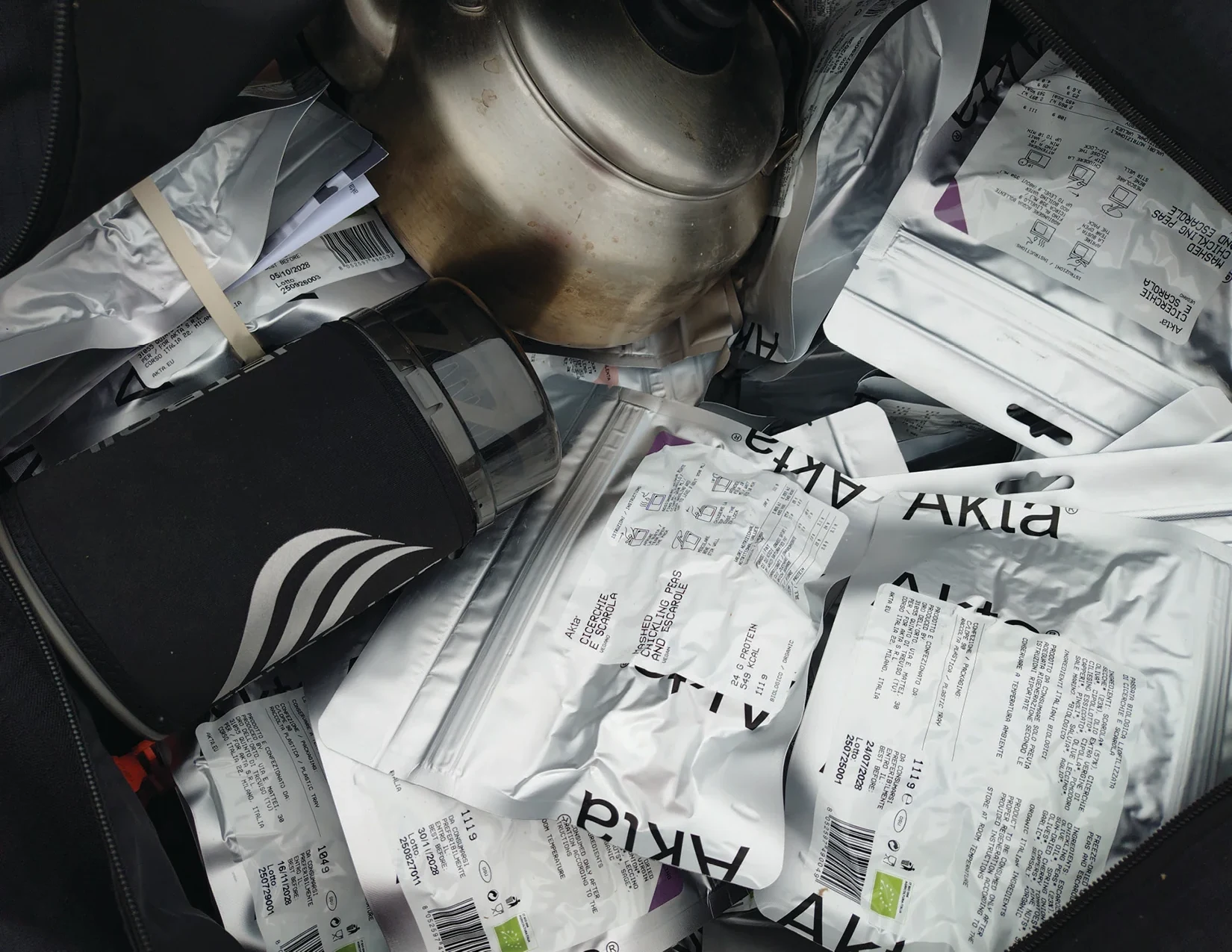
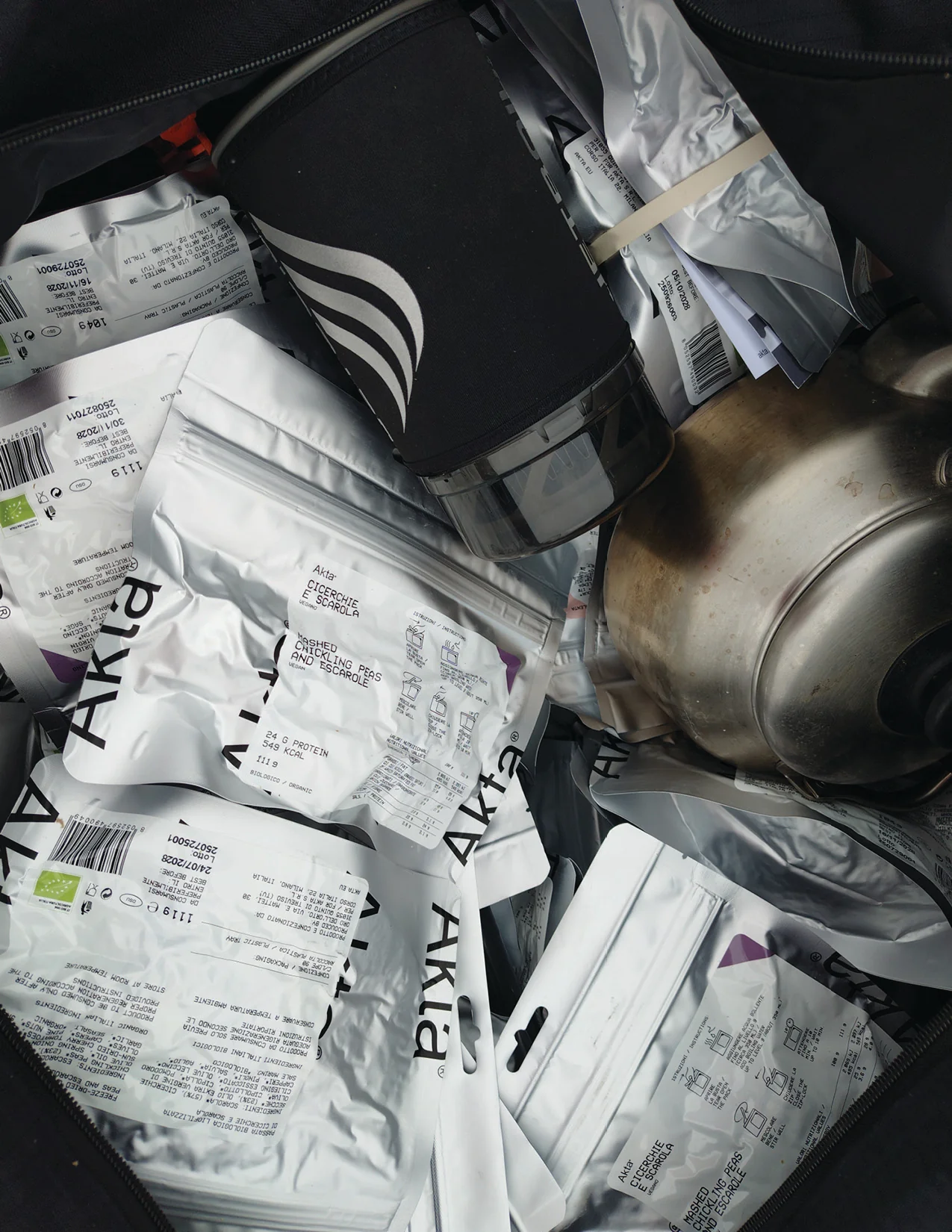
Akta
Akta makes freeze-dried meals for people who eat where there is no kitchen: ocean crossings, high camps, long days on foot. Italian regional recipes, organic ingredients, and a process that removes the water and leaves almost everything else in place. Founded by Giulio Bertelli, it takes its name from the ancient Greek word for a headland, the uncertain line where land ends and the sea begins.
We made the brand and the packaging with POMO.
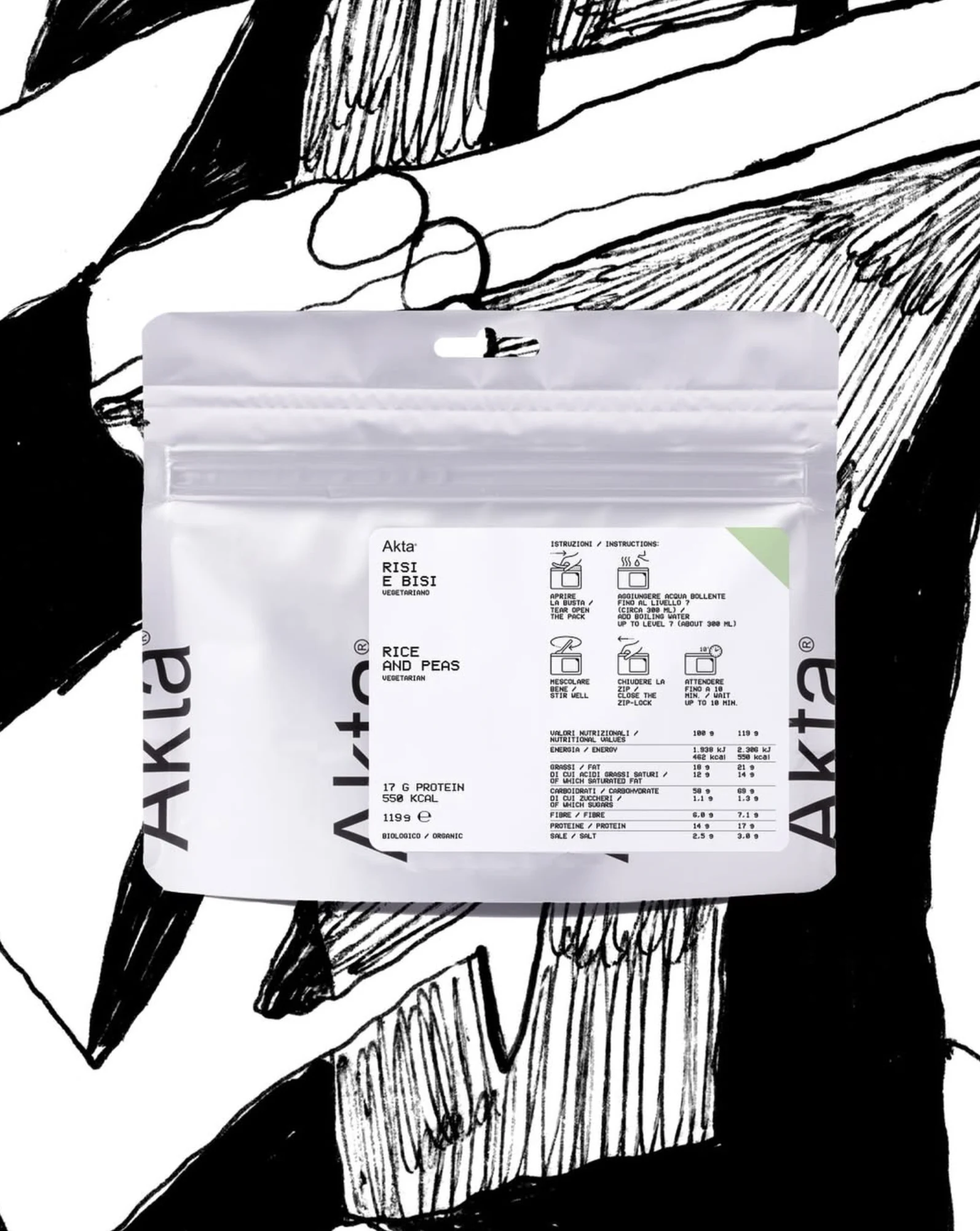
Akta is equipment, and the packaging says so. What sits on the front of the pouch is what a person needs while holding it: the dish, the weight, the energy, the time it takes to be ready. Typography is plain, the hierarchy never moves, colour does the work of telling one range from another. Nothing is hand drawn and nothing is nostalgic.
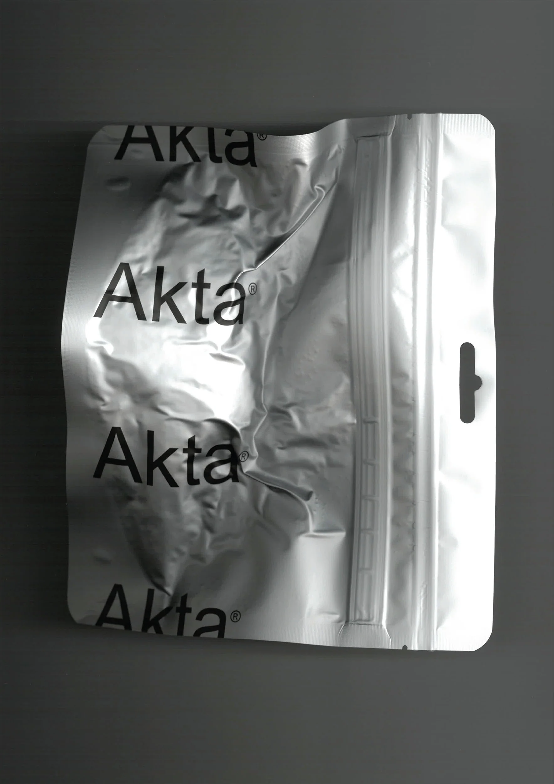
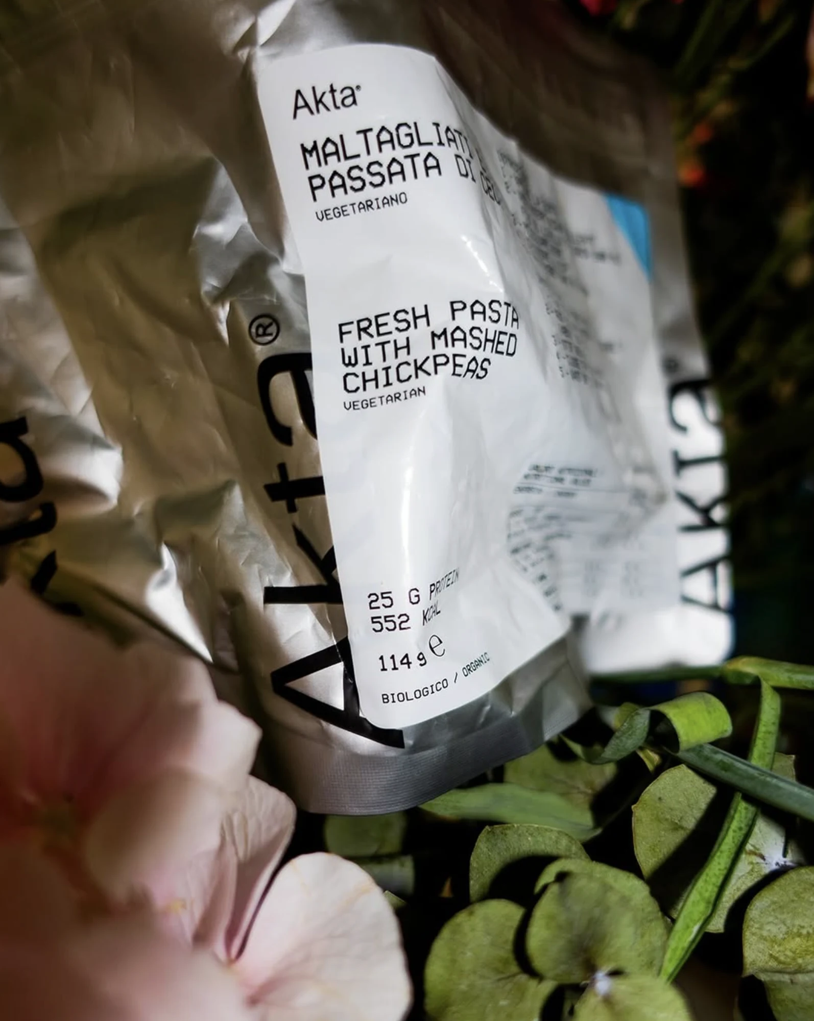
The register is deliberately undesigned. Default typefaces, standard grids, decisions that look as though they were never taken. It is the discipline of technical supply, rations, laboratory labels and charts, where form answers to use and the object has to stay legible after a month in a drybag.
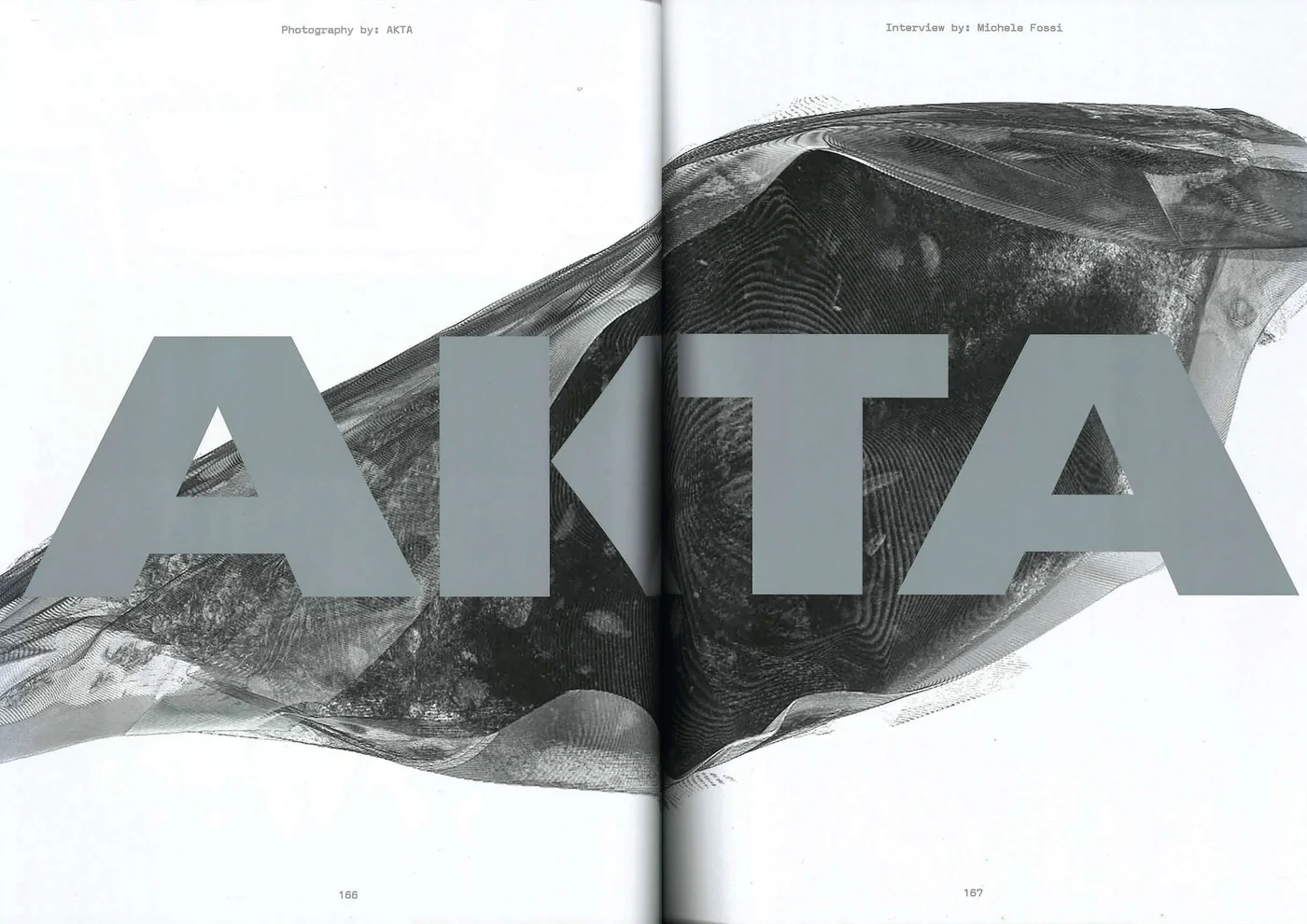
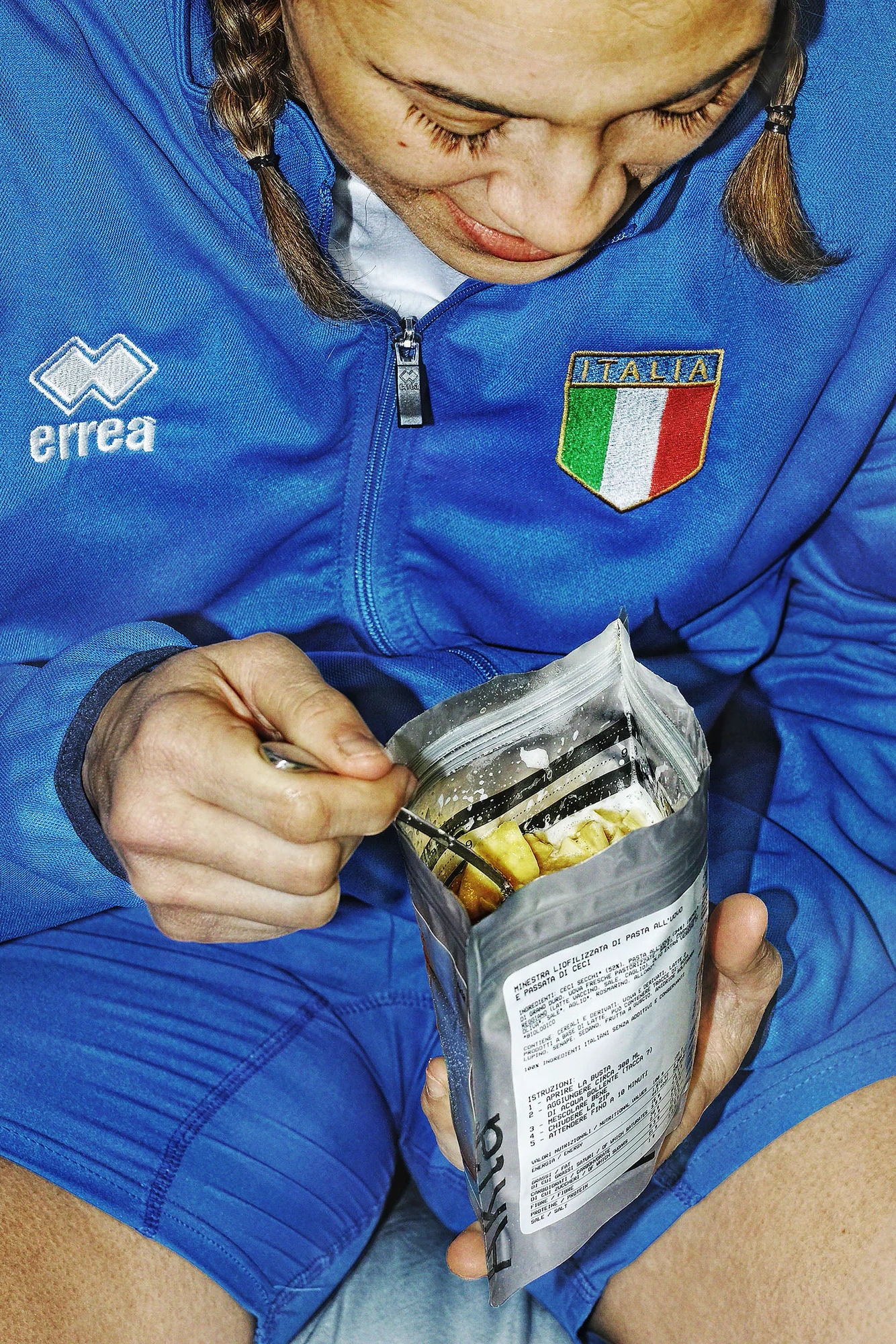
One of the campaign images.
The name points at a threshold, and the brand keeps to it. Food cooked in an Italian kitchen, eaten in places where kitchens do not exist, with the archive of regional cooking behind it and a sailor's dry bag in front.
Credits
Client: Akta
Creative direction: POMO
Scope: Brand identity, packaging
Website: Display