
Linecheck
Linecheck is Italy's leading music meeting and festival: six days across Milan and Bologna where the music industry and the culture it produces meet in the same rooms. In 2025 the festival opened up to the wider field of performing arts, and asked for an identity able to hold that shift and the editions that follow it.
The rebrand covers concept and manifesto, logotype and typography, the art direction of the campaign imagery, the website, and the rules that keep the system coherent while it grows.
The identity rests on one idea. Linecheck lives in an impossible balance between opposites: the radical integrity of its spirit and the poetic softness of its expression. It is a tension held on purpose, not a compromise between the two.
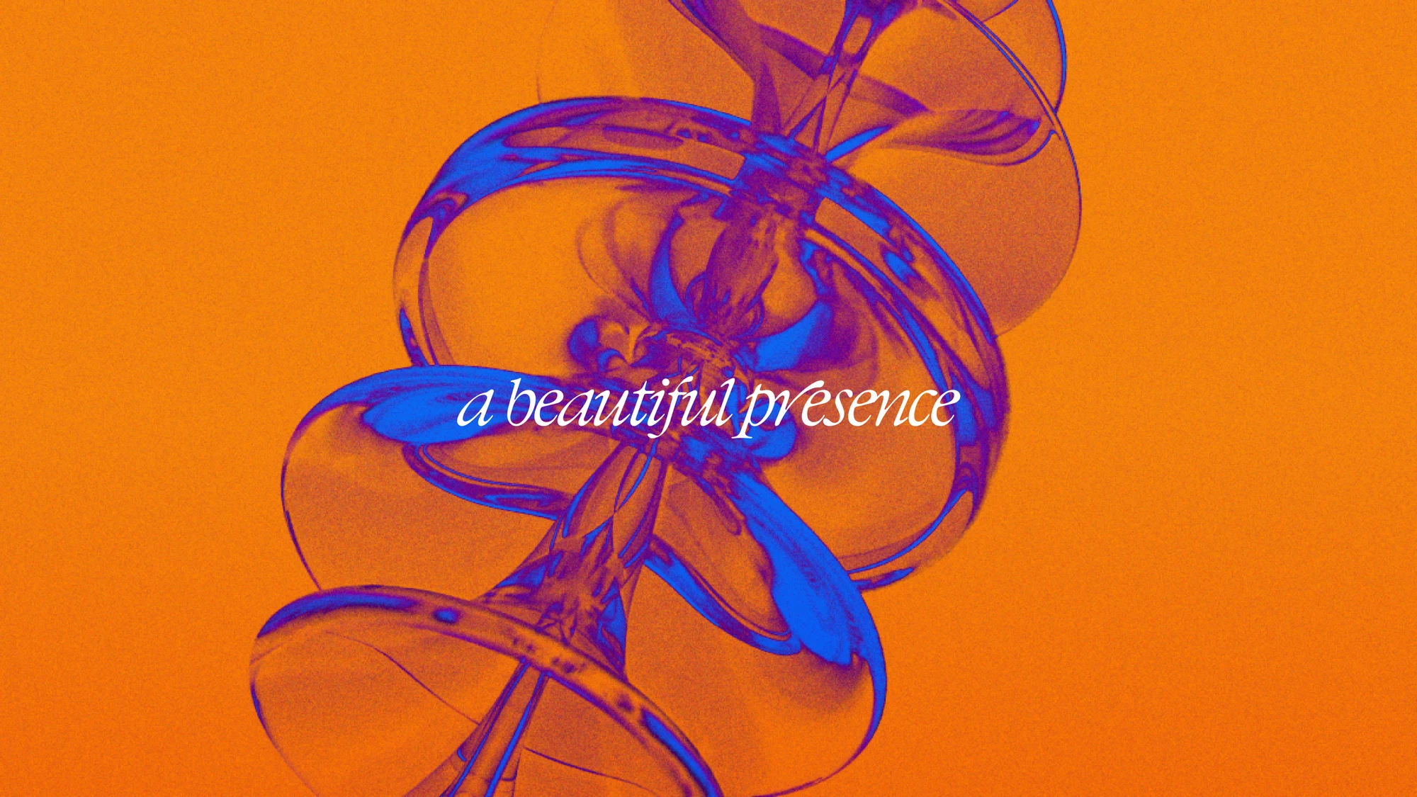
The structural half is severe: columns, spartan margins, a synthetic geometric typeface, a radically neutral greyscale. The expressive half lives in colour, image and motion, where the system turns soft and intimate. The new logotype sits on the structural side, redrawn and retyped to carry the same rigour as the grid around it. The palette sits on the other, built as a pair of opposites where one colour reads as the negative of the other, designed to be swapped every edition without touching anything else.
Website for the 2025 edition.
The site holds two things that pull in opposite directions: a meeting for the industry and a festival for the public, over six days and two cities.
Meeting and Festival stay parallel worlds, each with its own programme, artists and speakers, reunited in a single schedule and a single path to tickets. The homepage opens on the manifesto and moves down through news, programme and passes. Editorial matters as much as the programme: the festival publishes continuously through the autumn, so the system carries the identity on its own, without a designer intervening on every post.
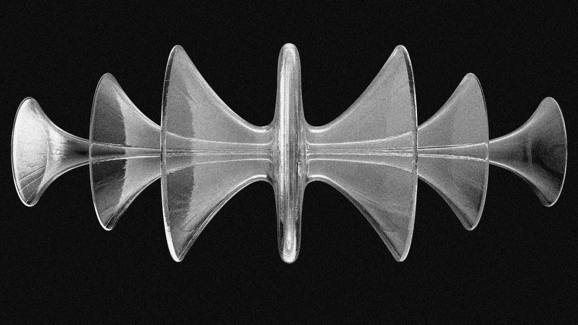
OLO: Linecheck's totem.
The campaign imagery is entirely built in 3D. At its centre is OLO, a study on sound waves developed by Marco Klefish together with the films. The art direction sets colour, light and material, with a treatment built on layers of noise that break the cleanliness of the render and give it warmth, closer to something photographed than to something simulated.
The identity was not made for one edition. Its structure, its typography and the rule that governs colour are built to be handed over and extended from one edition to the next.
Credits
Client: Linecheck
Scope: Identity, art direction, website design
OLO symbol and films: Marco Klefish
Development: MH srl, Pyet.ro